Branding Monsters:A Visual Experiment
 Last week, I went on a twisting, turning link following journey, and ended up on Hugs for Monsters, a showcase for the work and thoughts of visual artist Joe Lifrieri. His site design is refreshing and charming, but it was a post on branding for the social web that sent my imagination scribbling.
We must abandon the idea of creating a brand entirely, and instead focus on creating a personality for an imaginary human being.
If our brand was a person, how would you describe them? Would you be their friend? Would you help them move? Would they help you? How do they feel about themselves? How do they speak to others? Instead of asking “What typeface represents this brand best?” ask how the brand would write their own name. How does this new entity define themselves? Answer that, and the branding becomes clear.
Well. Huh.
Before I’d finished reading, the inside of my skull had become a projection screen/sketchpad and my “Brand” was revealing it’s form:
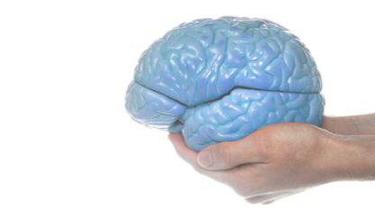
An amorphous semi-glowing blue living rock thing. Shaped sort of like a brain, but not exactly.
Um. Yeah. Ok.
It looked a bit like it’s out of an episode of Twilight Zone (one of the remake episodes, with the pricier special effects) and not exactly something anyone wants to build a relationship with. Not good.
But as I watched, it… moved. Evolved. Uncurled, unfurled, and looked less boulder like, more origami-cabbage-folded-out-of-granite-ish. It lifted a humanoid sort of head from between the leaves, and I stared. (Can you stare inside of your own mind? I’m not really sure of the mechanics of this stuff sometimes…)
I pondered the marketing implications, and saw a few problems.
 People might be intrigued by a semi-amorphous-blue-granite-cabbage-with-a-head. They might tune in to marvel at it, or watch with hypnotic horror. But most people would be unlikely to form a relationship with such a thing, even if it is vaguely brain like. (maybe especially if it’s vaguely brain like)
The branding solution seemed pretty obvious…. it (I) needs to stop curling in on itself, unfurl its wings, and just go ahead and become whatever it is going to become.
“It would be far less threatening,” I thought, “if it weren’t a vague-monster-mutant, but was a specific monster-mutant, maybe with a friendly face.”
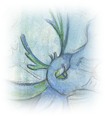
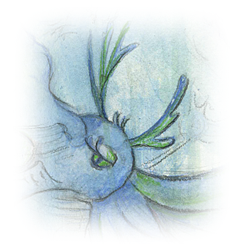
So yesterday I dug out a scrap of watercolor paper, and let the thing pick one form, to see what that might tell me. Mind you, this isn’t necessarily the final shape - and it certainly isn’t the only shape, but I thought it would be interesting to draw it, and see what it could tell me.

You can click on it for the enlarged version, if you like… but mostly it just looks messier that way.
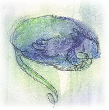
I added the antlers for my own amusement, they don’t really seem to be a natural part of the creature itself, but I like the idea of it picking up TV reception with them, and being sensitive to customer vibes. I included drawings of the cabbage-rock-brain-things, too… so you can see that they are really pretty disturbing and vaguely threatening. I was amused by the curled up things tails, making them appear more brain like.
Considering the grown-up Brand-Mutant turns up some interesting insights.
For one thing, it only has one eye…. a single large focus. It definitely has a long-tail. There’s a lot of energy and uplift involved, and the appearance of motion in many directions, even as it seems to be flying only in one. (I’m tempted to go in and add a propeller to it’s head, turning it into a helicopter. It likes that idea of being especially mobile)
Though you can’t really tell, there are others of it’s kind in the background, suggesting it is a social sort of thing, part of a community, maybe a little flock network. It’s not clear if those are maybe secondary products, or related sites/companies, but there’s definitely a network aspect to it, making the adult Brand more like a neuron than a complete brain.
Oh, and it has claw/feet - but they’re tucked up under its feathers. It uses them for grasping ideas and concepts.
While consistent with my own style of layered colors and drips, drawing is curiously influenced by the HugsforMonsters design, and likely reflects my sense of kinship with the little I’ve seen of Joe’s approach. I haven’t seen enough of him yet to know if he’ll be annoyed by that, but… there it is.
As for the questions Joe suggested…
 If your brand was a person, how would you describe them?
Quirky. Both grounded and flighty, in different phases. Expressive. Transparent (more in the human sense, not the business sense) Trustworthy and Trusting.
Would you be their friend?
Sure, though it would be an odd sort of friendship, I think. Very cirque.
Would you help them move?
Sure, but it can do more heavy lifting than I can!
Would they help you?
I think so. I have this image of it flying-flitting around my head, whispering in my ear. Maybe zooming off to find readers, customers, networking…. oh I get it! It’s more hummingbird than monsterbird!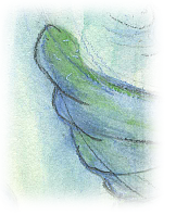
How do they feel about themselves?
It doesn’t spend a lot of time in self reflection. It leaves that to others: me, my readers, my customers.
How do they speak to others?
Hums, whirs, and by playing messenger, delivering notes, books, information from others. I think it can project images with its mind, too. (yes, I know this is getting weird, but I dont want to censor at this stage!)
Instead of asking “What typeface represents this brand best?” ask how the brand would write their own name.
If forced to write, it would be in a sort of handprinted scribble in crayon. But it prefers to present it’s name as a series of images, projected directly into people’s minds. (Freaky)
How does this new entity define themselves?
Answer that, and the branding becomes clear.
I don’t think it does define itself.. prefering to let others draw their own conclusions.
So there you go. A visualization experiment in branding. I don’t think it’s quite what Joe from HugsforMonsters meant, but… I got a lot out of it, including one really concrete message to take away…
Spread your wings and fly.
Even if you look like a granite cabbage, the flying is the thing.
So, what do you think?
Would YOU buy anything from Brand-The-Flying-Cabbage-Brain?


{ 3 comments… read them below or add one }
Hi Tori:
I enjoyed your post and seeing how you spent time doing the exercise and applying it to your life. Hugs for Monsters certainly seems like an interesting site with some thought-provoking observations. I enjoyed your flying thingy and ultimately your take away: Spread Your Wings and Fly. So true.
That’s hilarious, Tori. Thanks for showing your visual thought process and the more analytical review of it. Sure, I’d buy from the monsterbird. It definitely has more personality than just a brain sitting there, even if it does have pretty flowy colors. A little more emphasis on the nose/mouth would help the “personhood” of the monsterbird image stand out a little more, at least on my monitor.
@Tim Glad you enjoyed my wackiness, Tim, and The Wacky Flying Thing says hello
@Beth The MonsterBirdThing appreciates your endorsement, and offers to send you a gift basket of spam. (I gave it a firm talking to). It could definitely use a mouth, but…. it didn’t appear to have one. No clue why.
I’m unlikely to actually develop the thing into actual branding, but I might play with my beloved blue brain a bit. I have some ideas now…. dangerous, winged ideas…